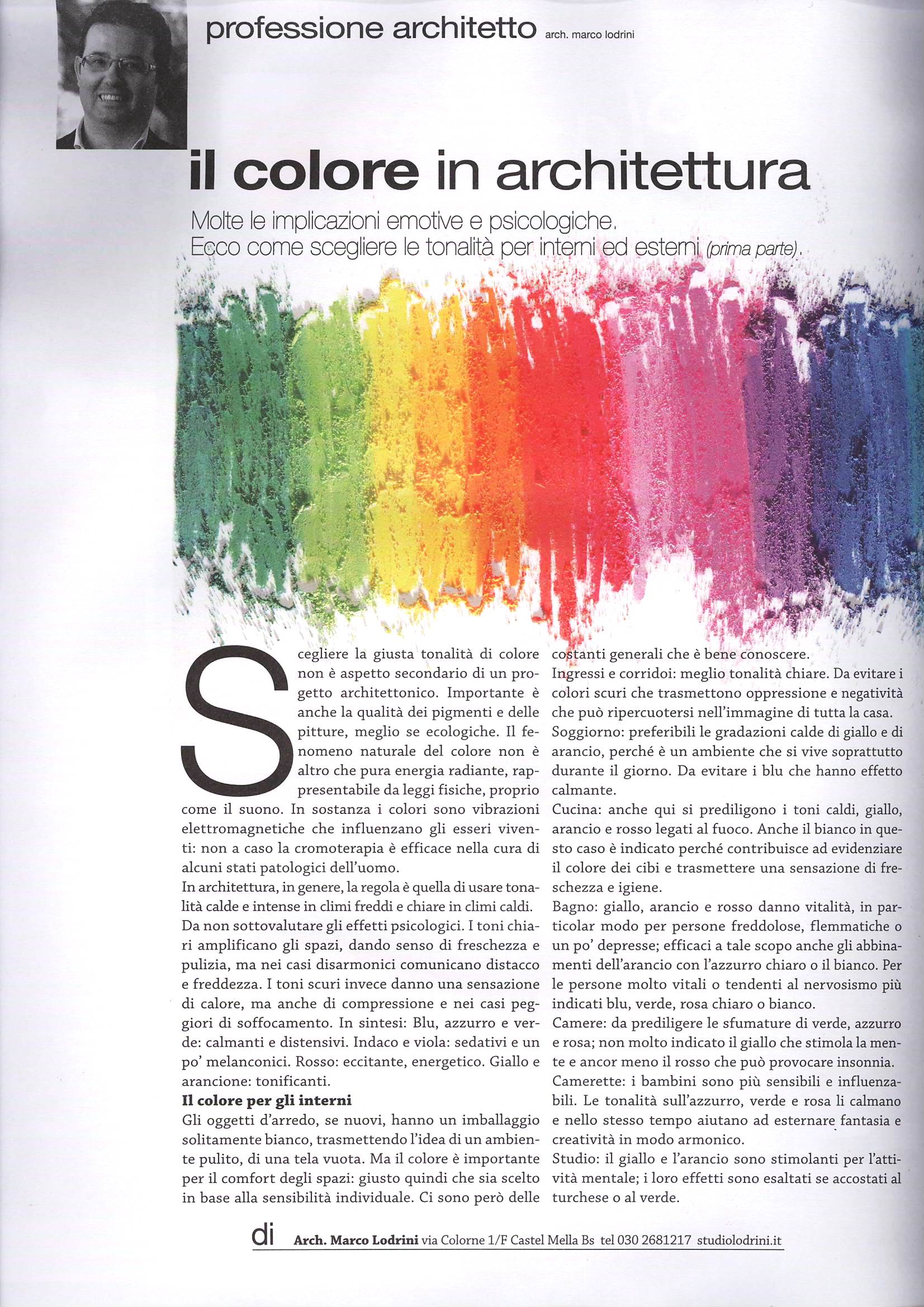
Color plays a central role in architectural design—not only as an aesthetic element, but also for its emotional and psychological impact. Tones influence the perception of space and the well-being of its occupants, which is why they must be chosen carefully, favoring ecological paints and natural pigments.
In cold climates, warm and intense colors are preferable, while in hot climates, light and bright tones are more suitable. Light colors expand and refresh, while dark colors add warmth but can make spaces feel smaller. Each color has a specific effect: blue and green are calming, red is stimulating, yellow and orange are energizing.
For interiors, choices vary according to the function of the space: light tones for entrances and hallways, warm colors for living rooms and kitchens, soft shades for bedrooms and children’s rooms, and stimulating hues for studies and bathrooms. Color thus becomes an essential tool for creating comfort, harmony, and quality living environments.